

omotesando 101
HOUSE, WORKSomotesando 101
category:HOUSE
year:2020
site:Tokyo,Japan
Floor area:90.16㎡
Photo:Kaku Ohtaki
collaborators:Yuki Kano Architecture
https://www.ykarchitecture.com/
omotesando101
This property has three layout-related issues that we have attempted to resolve in the following manners through renovation work.
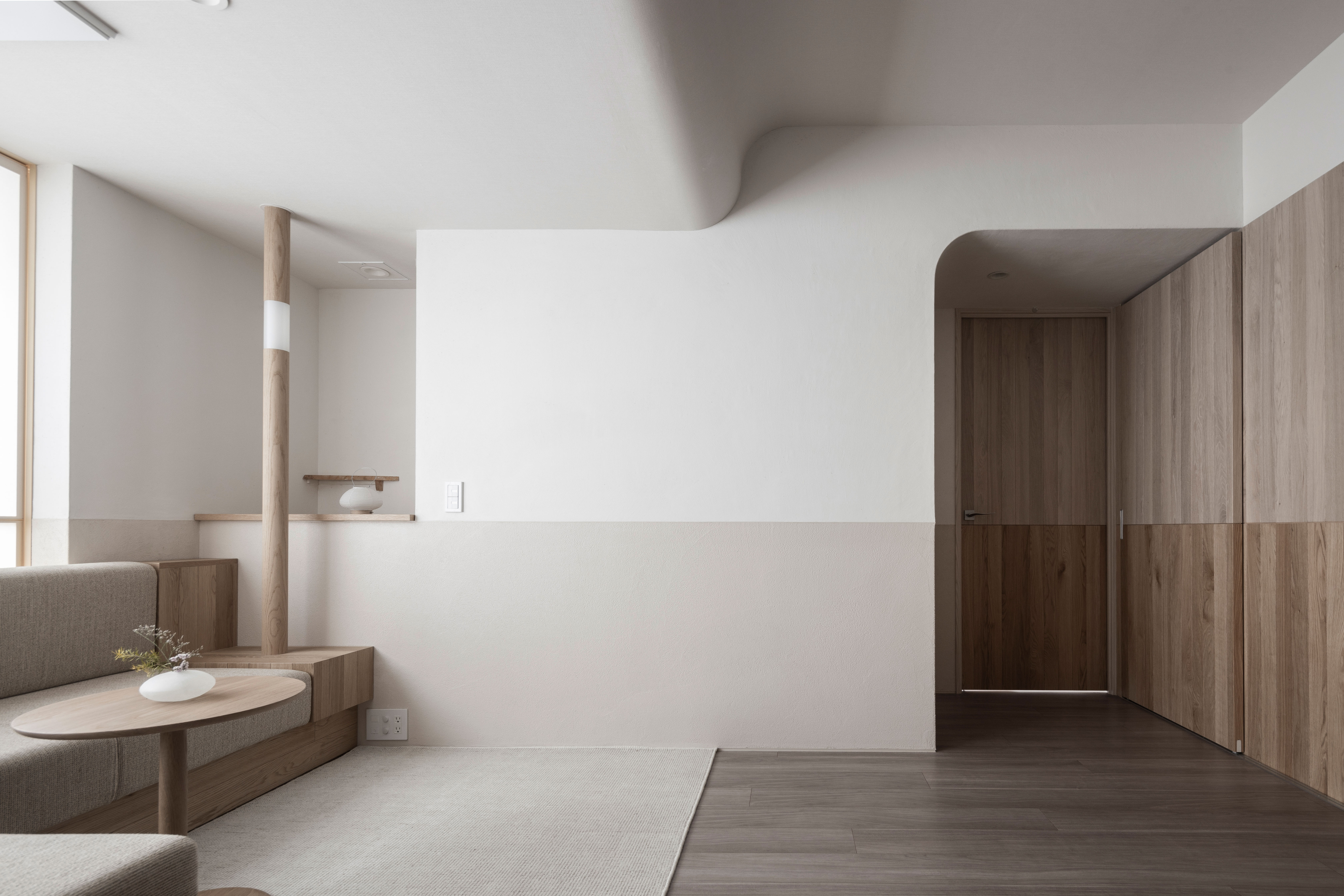
1. The existence of a beam that splits the upper portion of the living/dining room into two
We designated the space in front of the beam as one with heavy foot traffic and the space at the back facing the windows as a place for relaxing. This allows the space at the back which is mainly for sitting down to have a lower ceiling only as high as the bottom edge of the beam, creating a ceiling height comfortable for people who are sitting down while concealing the unsightly beam. In addition, we delicately connected the two ceilings of different heights to create a structure that naturally guides one’s attention to the windows.
2. Unsightly window grating
There was a black aluminum grating outside the windows of this living/dining room facing the ground floor for security reasons. We installed a screen with Japanese “washi” paper to conceal the grating while allowing natural light to filter through and protecting the privacy of the owners.
3. Narrow living/dining room
We have arranged a series of L-shaped sofas here to serve as sofas for the living room as well as dining chairs.
By incorporating the simple element of an L-shaped sofa, we were able to make the entire space feel more spacious and expand the range of its possible functions.
Regarding the choice of materials and the overall composition, we used translucent Japanese “washi” paper for places that benefit from natural light filtering through, wood and rattan for fixtures that come into contact with human hands, and construction materials such as plaster and diatom earth for walls. As much as possible, we selected the appropriate materials for each site from the natural materials available. Next, we used horizontal lines to segregate the space into zones so as to ensure that the different components co-exist with one another in the same space. These horizontal lines were also used because they give the space a feeling of spaciousness through an emphasis on unity and perspective within the space. The horizontal lines closer to the body were given more intense colors and pronounced textures so that they feel more intimate to people. Conversely, the upper sections have milder colors and textures so that they feel less imposing and more expansive. After we have set up the space based on our model, we threw off the overall balance of the space ever so slightly by incorporating pillars and alcoves. In doing this, we hope to call to mind the Japanese aesthetic principle of discovering beauty in imperfect objects.
omotesando101
この物件には予め3つの空間的な課題があり、リノベーションによってそれぞれ以下のような解決を試みています。
1、リビングダイニングを上部で分断する梁型の存在
梁で分断される手前の空間を動きのある場所、窓に面する奥の空間を落ち着きのある場所と定義し、主に座る為にある奥の空間は梁の下端まで天井を下げ、座った時に心地よい天井高とし、鬱陶しい梁型を隠しました。また意識が自然と窓に流れるような構成とするため、高さの異なる2つの天井をゆるやかにつなげました。
2、眺望上好ましくない面格子
地上階に面するこのリビングダイニングの窓の外には、防犯の為に黒いアルミ製の面格子がありました。その格子を隠し、光を取り込み、プライバシーを確保するために、和紙を貼ったスクリーンを用意しました。
3、リビングダイニングの狭さ
リビングのソファ兼ダイニングの椅子となる、ひと続きのL 型ソファを配置しました。
L 型ソファをひとつの簡潔な要素として挿入することで、空間を広く感じさせるとともに使い方の可能性を拡げることができました。
素材の選定や全体の構成については、光を採り入れる箇所は透過性のある和紙、人の手に触れる建具などは木や籐、その他の壁は漆喰や珪藻土などの左官材料とし、極力自然素材の中から、適材適所で素材を当てています。次にそれらをひとつの空間の中で秩序をもたせるために、水平なラインで区切っています。この水平ラインは、空間にまとまりやパースペクティブの強調による広がり感を与えるきっかけにもなっています。身体に近い水平ラインの下部は色味や素材感を強くし、身体の拠り所となるよう配慮しました。反対に上部は存在感が少なく広がりを感じさせるように、それらを弱くしています。そして、規範に基づき空間を整えた上で、丸柱や床の間を入れ込むことで空間のバランスを少し崩しています。そうすることで、不完全なものに対して美しさを見出す、日本的な美意識を想起させることを期待しています。